As stated on LovelyPackage:
“The Oggau Estate is a new wine growing estate that produces 9 wines with different characters. Each wine has its own individual character with its own story and complex, changing relationships. A wine family comprising of grandparents, parents and children with intrigue, secret affairs, arguments, colourful characters and the odd black sheep. A typical family clan.”
x
Saturday, 31 October 2009
Tuesday, 27 October 2009
Monday, 26 October 2009
Friday, 23 October 2009
Thursday, 22 October 2009
Friday, 16 October 2009
Macdonald and Thompson
Linking in to my initial ideas for the second part of the What is Good? briefing, I came across these two business cards today during the stocks and substrates seminar with Justin. Although they were aimed to detail what stocks are available to print on, as well as print finishes and paper coatings I mainly wanted to highlight aspects regarding layout... so I swiped them for photographing.
The main characteristic for me was how in both examples the type is set and aligned to the left hand side. Naturally this could be due to the way our culture reads from left to right, but perhaps if you consider that when a right handed person holds the card they also need to read it then you might see what I am trying to get at.
With business cards being a possible outlet for my What is Good? resolution, I feel that the typographical layout may be a strong design element that I need to address given that my focus is to promote and celebrate being left handed.
x
Wednesday, 14 October 2009
Eye Magazine
After finishing some delightful soup and a cold can of coke, I chose to spend half of my lunch break today doing some more format research and came across this useful document on Eye Magazine's website.
Outlined above are all the relevant measures required should you be submitting some advertisements to the publication, but cunningly enough they are also useful when trying to research the exact size and bleed measurements for your own print based document.
You would have thought all the popular design magazines would have one of these on their websites, but so far this is the only one I have found. The quest continues.
x
Saturday, 10 October 2009
Monograph
"Monograph is a monthly publication from Creative Review, provided as an additional benefit to all subscribers. Each month, it showcases a personal project or body of work. Monograph is distributed with subscribers' copies of the magazine only and will not appear in newsstand copies."
As with the Canteen publication collected over summer, the main things that attract me to this feature booklet focus around the format and page layout. Particularly influential is the extent to which the document is image driven with minimal informative text. The format itself is A5; an aspect I consider to be quite rare within the industry. Yet the logic behind it makes complete sense from a printers perspective given the standardized paper sizes worldwide.
The feature that tops it off for me though, is how a thin sheet of trace separates each printed side of the publication. This gives an unexpected tangible quality to make such a straight forward document appear more diverse. It also enhances the exclusive connotation given by the description on the cover.
This is most definitely an attribute that I would like to explore within my own design for print. I am a keen admirer of the smaller details that make something feel more personal.
x
Friday, 9 October 2009
Canteen
Over the summer break I managed to pop down to London town to visit a friend and also have a cheeky meal at their place of employment - Canteen. It's a British restaurant that specializes in classic British food that your casual tourist would expect us to eat every day of the week. Either way this book about the source ingredients caught my eye for its vintage appearance and consequently I have been wanting to document it ever since. Looks quite like an authentic ration book wouldn't you say?
The main thing that I like about this book is the design of the page layout and the relationship that the type has alongside image. The compositions seem to flow effortlessly and allow your eye glance across without having to do any real work. This in my opinion is how a publication should be.
Furthermore the typeface choices themselves are also particularly effective, especially the bold, upper case sections of Futura.
In relation to my design for print brief, the format and layout are the two main aspects that I may draw influence from as they are highly successful and work well given the context.
x
Wednesday, 7 October 2009
Jeeyun Michaella Chung
I originally came across Jeeyun Chung last week whilst documenting the left handed notebook I got as a gift over summer. Having been on her website it turns out that the book is part of a series where there are also designs specifically for right handed and ambidextrous people.
-------------------------------------------------------------------------------------------------
Right Handed:
Left Handed:
Ambidextrous/Both Handed:
I really like the way in which the problem of peoples writing has been addressed through a simple and logical approach to design. It's one of those 'why didn't I think of that?!' situations.
What's more the colour coding works really well given the books work in a series, I'm just a little disappointed that us lefties haven't been given the special treatment...again!
x
p.s the stock choice is archive text paper which in addition to being designed for long life and strength also has as very nice tangible quality believe me!
Monday, 5 October 2009
Recyclage De Luxe Pt. 02
I have finally discovered the culprit of the Recyclage De Luxe campaign and am feeling quite a big sense of relief. It's something that has been niggling at me for over a month now and would you believe the answer was right on my doorstep!
Cristiana Couceiro, otherwise known as Sete Dias is the guilty party and a designer that I looked at last year whilst trying to find inspiration. Peace at last.
Click to enlarge... it's better that way.
x
Cristiana Couceiro, otherwise known as Sete Dias is the guilty party and a designer that I looked at last year whilst trying to find inspiration. Peace at last.
Click to enlarge... it's better that way.
x
Wi// W • rk f • r G • • d
These are a few more bits designed by Will Work for Good that I have come across today and find quite appealing.
Firstly, this packaging for a group called Amazing Baby caught my eye for the use of gatefolds, die-cutting and embossed typography mentioned within my design for print presentation last week. The way in which the die-cuts reveal additional imagery underneath the cover is definitely something I would like to experiment with!
And secondly, this LP cover for a group named Sunday Night in Glasgow fuses together so many elements that appeal to me within the design practice. Clean, clinical and crisp imagery. Not too complex, not too straight forward. Printed in spot gold with fluorescent green. What's not to like. Almost certainly a piece of design I wish I could get my hands on.
x
Gay Beach
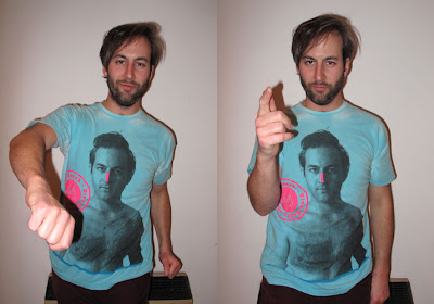
In visiting London for a few days over the summer I acquired myself this tee from American Apparel on the simple premise that I like how it looks and I like how it fits.
Designed by Will Work for Good, I was mainly attracted to the central monotone figure that in combination with the two vibrant spot colours creates a very simple, yet effective composition. What's more I was also drawn in by the nostalgic feeling conveyed via the half toning effect often associated with vintage imagery.
The concept behind the design was aimed to be a 'one-off' special for a nice chap called Ted who presents a Viva Radio show in America titled 'Gay Beach'. To reference WWFG themselves:
"The design is slightly inspired by Beverley Hills 90210. We kinda felt like Ted was exposing too much and a thick streak of Zinka was in order".
Zinka being a waterproof brand of sunscreen...
Either way, the main point here was how the colour limitation and approach to the concept had been addressed. I'm sure you will see me wearing this around a lot. Enjoy.
x
Sunday, 4 October 2009
Design for Print
Whilst reading books on design for print it immediately became evident as to how many aspects needed to be considered from a designers perspective. As a result I aimed to focus in on what I found a particular interest in, this being print finishes and techniques that give a tangible quality to a given piece of design and really make you want to touch it.
As the presentation had a limitation of 5 minutes, I selected to research the following:
- Foil Blocking
- Embossing & Debossing
- Varnishing & Spot Varnishing
- Half Toning
- Perforation
- Die Cutting
All of the above I aim to achieve a complete and informed knowledge upon via applying myself throughout this module. This includes researching, trying, testing and experimenting.
FOIL BLOCKING:
image credit: The Consult • http://www.theconsult.com/
EMBOSSING & DEBOSSING:
image credit: Ruiz • http://www.ruizcompany.com/
VARNISHING & SPOT VARNISHING:
image credit: Commune • http://www.commune-inc.jp/
HALF TONING:
image credit: Commune • http://www.commune-inc.jp/
PERFORATION:
image credit: Established • http://www.establishednyc.com/
DIE CUTTING:
image credit: Widgets and Stone • http://widgetsandstone.com/
x
As the presentation had a limitation of 5 minutes, I selected to research the following:
- Foil Blocking
- Embossing & Debossing
- Varnishing & Spot Varnishing
- Half Toning
- Perforation
- Die Cutting
All of the above I aim to achieve a complete and informed knowledge upon via applying myself throughout this module. This includes researching, trying, testing and experimenting.
FOIL BLOCKING:
image credit: The Consult • http://www.theconsult.com/
EMBOSSING & DEBOSSING:
image credit: Ruiz • http://www.ruizcompany.com/
VARNISHING & SPOT VARNISHING:
image credit: Commune • http://www.commune-inc.jp/
HALF TONING:
image credit: Commune • http://www.commune-inc.jp/
PERFORATION:
image credit: Established • http://www.establishednyc.com/
DIE CUTTING:
image credit: Widgets and Stone • http://widgetsandstone.com/
x
Subscribe to:
Posts (Atom)