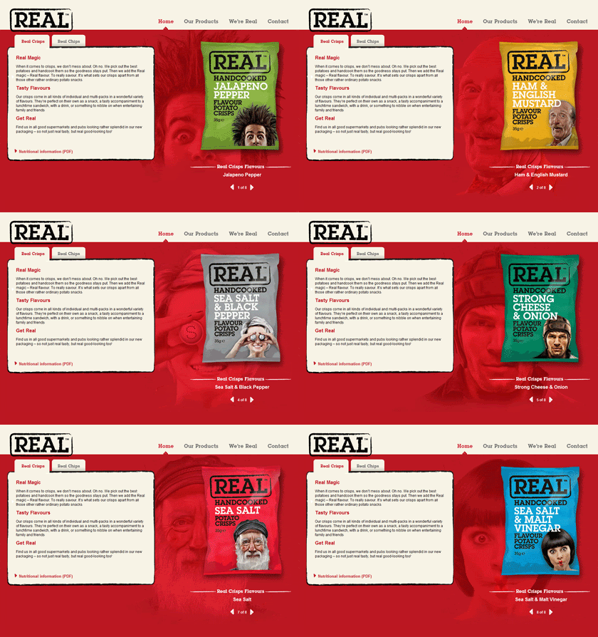
 In my eyes they have got it spot on, ITC Lubalin Graph Std is the perfect typographic choice from which to package a no-nonsense, straight-up and honest product.
Their website is beautiful as well, bonus: Real Crisps
JOKE FREE YOUTH
 In my eyes they have got it spot on, ITC Lubalin Graph Std is the perfect typographic choice from which to package a no-nonsense, straight-up and honest product.
 As seen within the documented BBCtv ident below, this 'Bat Wings' symbol for the British Broadcasting Corporation was designed by Abram Games and used as the companies first onscreen logo.
 Of particular interest to me, the following design elements appear crucial to reference in terms of making informed design decisions within my own progression: